
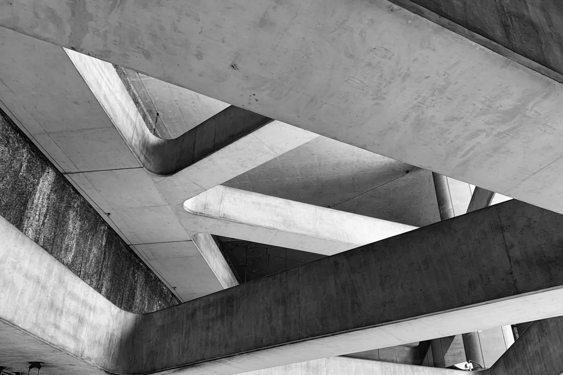
I've spent years studying buildings that feel right without being able to articulate why. I've noticed a pattern: the most successful ones are often based on simple geometric ideas that are executed with precision.
A grid repeated across a facade creates rhythm. A proportion maintained across scales creates coherence. A simple form like the A-frame becomes iconic and structurally efficient simultaneously.
This observation freed me from the assumption that complexity is sophistication. I used to think the most interesting designs would be the ones with unusual forms and intricate geometries. Through experience, I've learned that unusual forms often become dated quickly, while simple geometry ages beautifully.
The Electric One stores work because they're based on a simple organizational grid. The proportions of shelving, the spacing of columns, the width of aisles, all relate back to this underlying geometric order. This simplicity allowed the system to scale across 150 locations without losing coherence.
The A-Frame cabin works because the form is structurally logical and proportionally considered. There's nothing unnecessarily complex. The geometry serves both practical and experiential purposes.
I've also learned that geometric simplicity requires much more design thinking than geometric complexity. It's easy to make something interesting by adding complications. It's hard to make something work and feel right with minimal elements.
This understanding has shaped how I approach every project. We start by finding the simplest geometric order that serves the program. We work within that order. We let complexity emerge from precision within simplicity, rather than from formal invention.
That creates spaces that are coherent, that age well, that people understand intuitively. That's good design.