
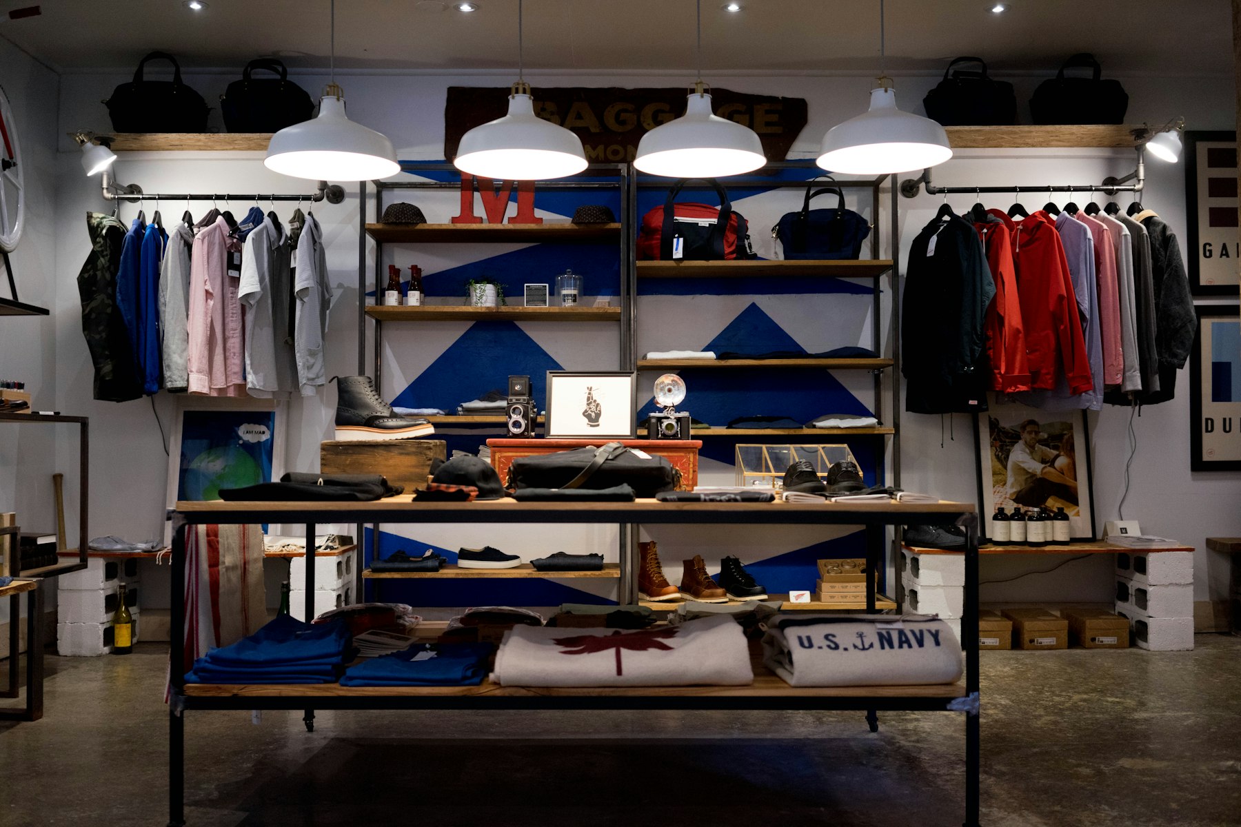
One of the defining projects in my career was designing and executing the Electric One retail stores across India. 150 locations. Different urban contexts. Varying site dimensions. One brand identity. That project changed how I think about design systems and scalability.
The brief itself seemed contradictory: create a unified brand experience across 150 stores while adapting to local contexts. Too often, the solution is to apply a rigid template everywhere. You get consistency, yes, but it feels plastic. Your space doesn't breathe with its local character.
What we developed instead was a system. Not a template. A system is a set of rules, proportions, and modular components that can flex and adapt while maintaining coherence. The palette was consistent: white surfaces, bold red accents from the brand. But the way these elements combined, the specific materials chosen, the detailing varied based on what made sense locally.
Here's what I learned by designing 150 times: the things that matter most are the ones that appear subtle. A single shelf dimension repeated across the store creates rhythm. The position of a light creates hierarchy. The width of a walkway determines how products are perceived. These aren't flashy design moves. They're foundational.
Most importantly, I learned to distinguish between brand consistency and design laziness. Consistency doesn't mean repetition of details. It means a repeatable logic that produces different results depending on the input.
Taking that experience forward, every project we work on at Studio Dotbox, whether it's a single residential unit or multiple commercial spaces, applies that same thinking. How do we create coherence while respecting context? How do we scale without losing craft?
That balance is what separates forgettable buildings from ones that age well.